df <- data.frame(
  x = c(3, 1, 5),
  y = c(2, 4, 6),
  label = c("a","b","c")
)df| x | y | label |
|---|---|---|
| <dbl> | <dbl> | <chr> |
| 3 | 2 | a |
| 1 | 4 | b |
| 5 | 6 | c |
p <- ggplot(df, aes(x, y, label = label)) +
  labs(x = NULL, y = NULL) + # Hide axis label
  theme(plot.title = element_text(size = 12)) # Shrink plot title
p + geom_point() + ggtitle("point")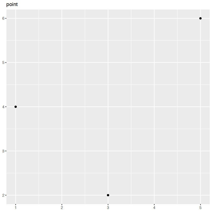
p + geom_text() + ggtitle("text")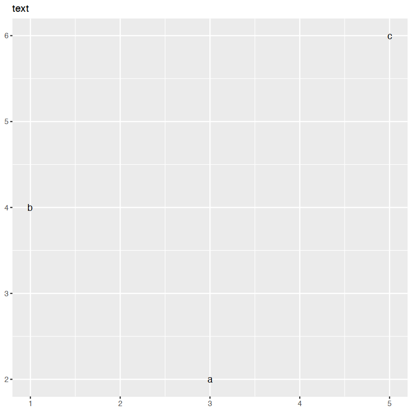
p + geom_bar(stat = "identity") + ggtitle("bar")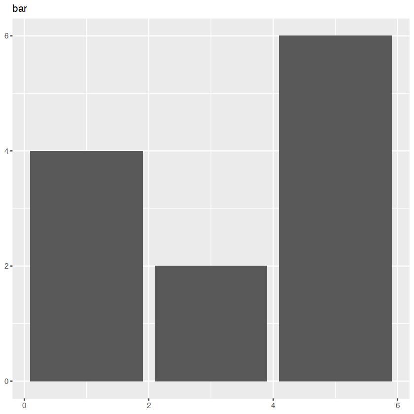
p + geom_tile() + ggtitle("raster")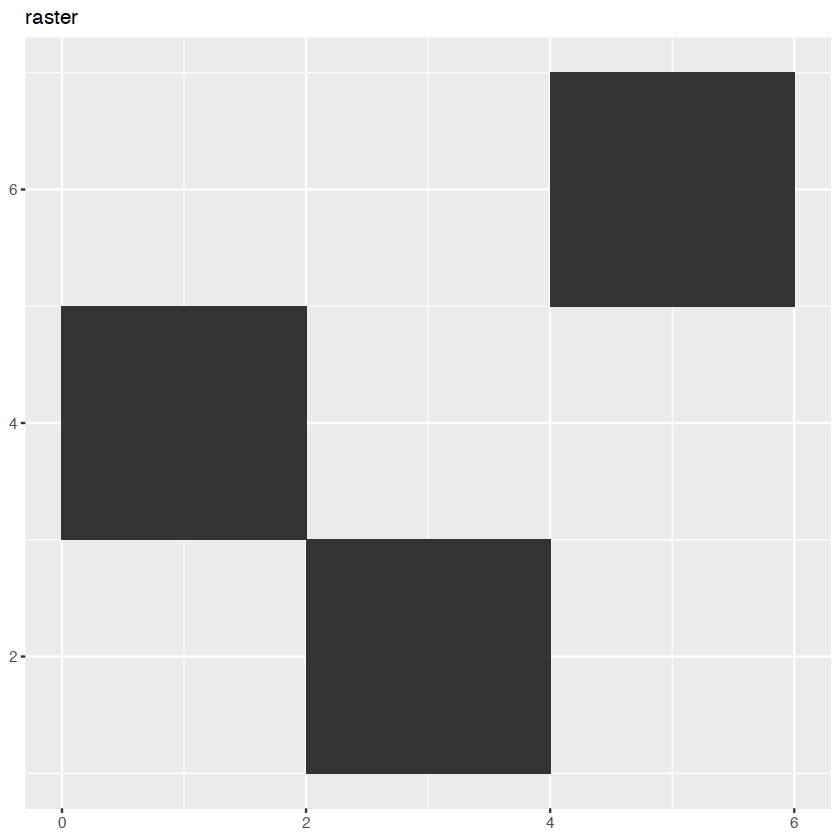
p + geom_line() + ggtitle("line")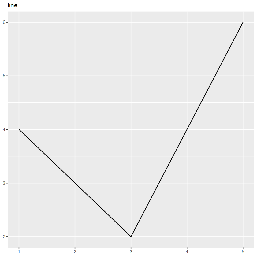
p + geom_area()+ggtitle("area")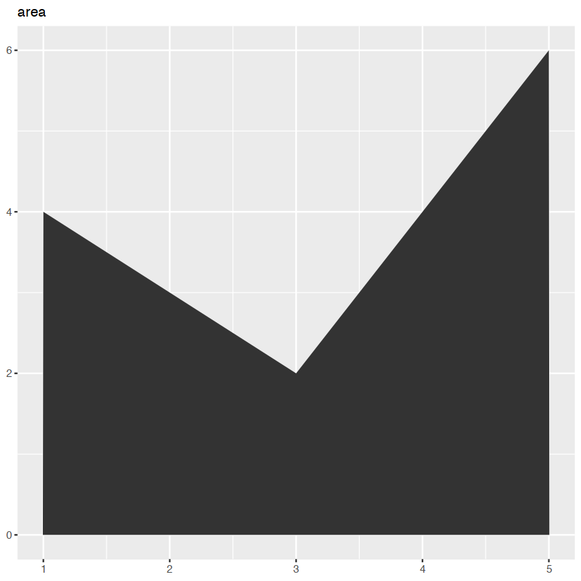
p + geom_path() + ggtitle("path")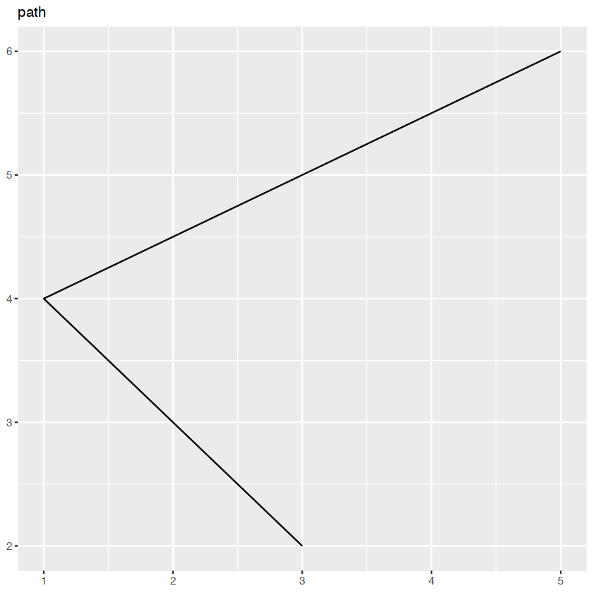
collective geoms
Geoms can be roughly divided into individual and collective geoms.
different groups on different layers
we want to plot summaries that use different levels of aggregation.
data(Oxboys, package = "nlme")
head(Oxboys)| Subject | age | height | Occasion | |
|---|---|---|---|---|
| <ord> | <dbl> | <dbl> | <ord> | |
| 1 | 1 | -1.0000 | 140.5 | 1 |
| 2 | 1 | -0.7479 | 143.4 | 2 |
| 3 | 1 | -0.4630 | 144.8 | 3 |
| 4 | 1 | -0.1643 | 147.1 | 4 |
| 5 | 1 | -0.0027 | 147.7 | 5 |
| 6 | 1 | 0.2466 | 150.2 | 6 |
ggplot(Oxboys, aes(age, height, group = Subject)) +
  geom_line() +
  geom_smooth(method = "lm", se = FALSE)
#> `geom_smooth()` using formula 'y ~ x'
`geom_smooth()` using formula = 'y ~ x'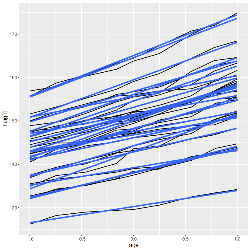
ggplot(Oxboys, aes(age, height)) +
  geom_line(aes(group = Subject)) +
  geom_smooth(method = "lm", size = 2, se = FALSE)
Warning message:
“Using `size` aesthetic for lines was deprecated in ggplot2 3.4.0.
ℹ Please use `linewidth` instead.”
`geom_smooth()` using formula = 'y ~ x'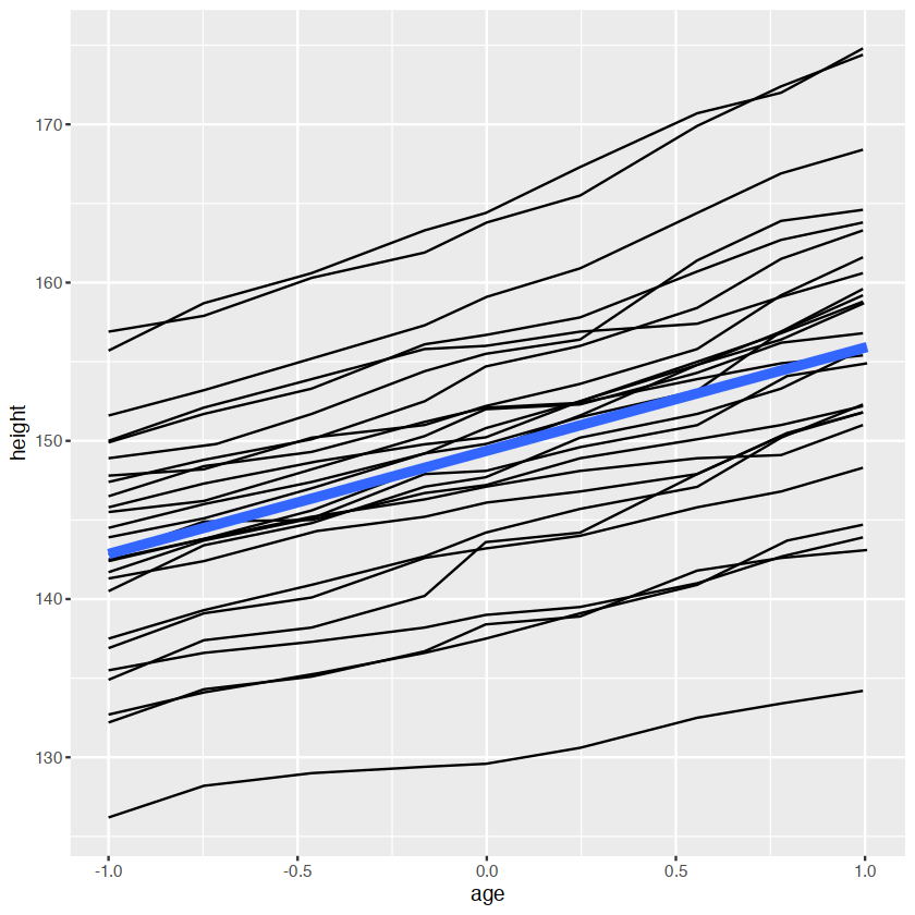
head(Oxboys)| Subject | age | height | Occasion | |
|---|---|---|---|---|
| <ord> | <dbl> | <dbl> | <ord> | |
| 1 | 1 | -1.0000 | 140.5 | 1 |
| 2 | 1 | -0.7479 | 143.4 | 2 |
| 3 | 1 | -0.4630 | 144.8 | 3 |
| 4 | 1 | -0.1643 | 147.1 | 4 |
| 5 | 1 | -0.0027 | 147.7 | 5 |
| 6 | 1 | 0.2466 | 150.2 | 6 |
ggplot(Oxboys,aes(Occasion,height))+
    geom_boxplot()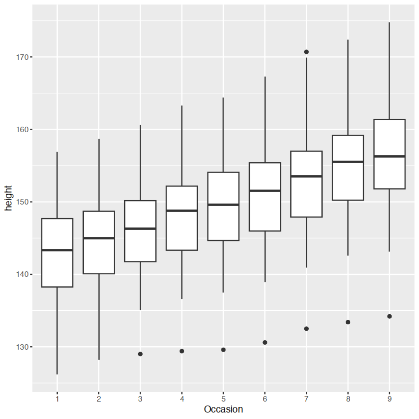
ggplot(Oxboys, aes(Occasion, height)) +
  geom_boxplot() +
  geom_line(aes(group = Subject), colour = "#3366FF", alpha = 0.5)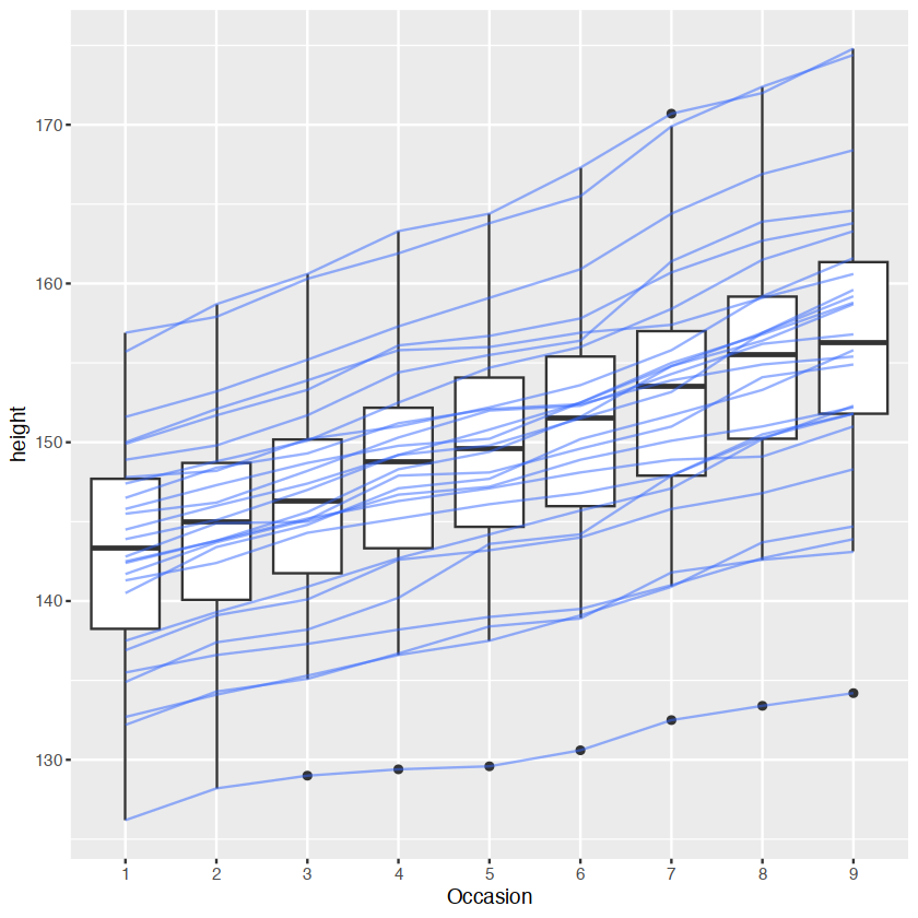
matching aesthetics to graphic objects
- lines and paths operate on the first value principle: each segment is defined by two observations
- ggplot2 applies the aesthetic value associated with the first observation when drawing the segment.
df <- data.frame(x = 1:3, y = 1:3, colour = c(1,3,5))

ggplot(df, aes(x, y, colour = factor(colour))) +
  geom_line( aes(group = 1),size = 2) +
  geom_point(size = 5)

ggplot(df, aes(x, y, colour = colour)) +
  geom_line(aes(group = 1),size = 2) +
  geom_point(size = 5)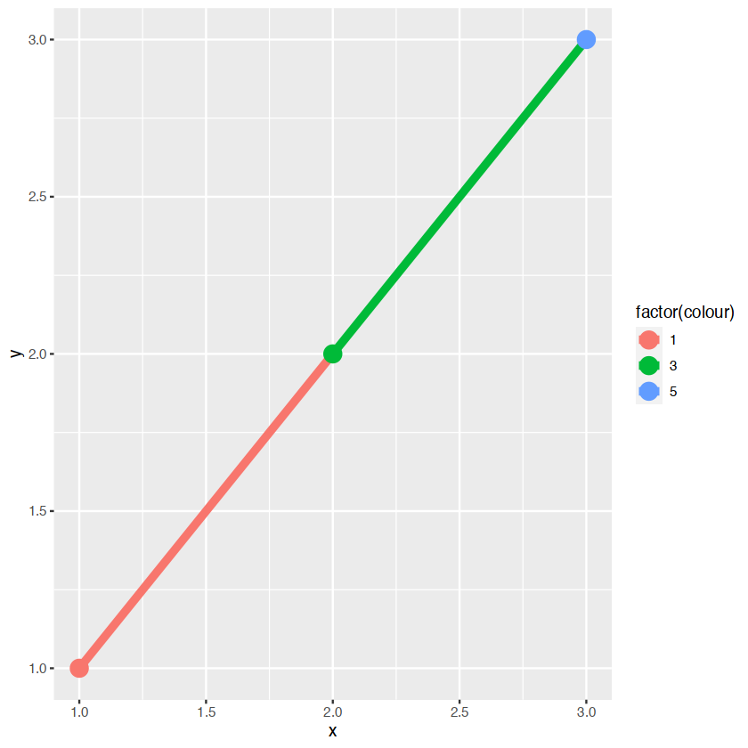
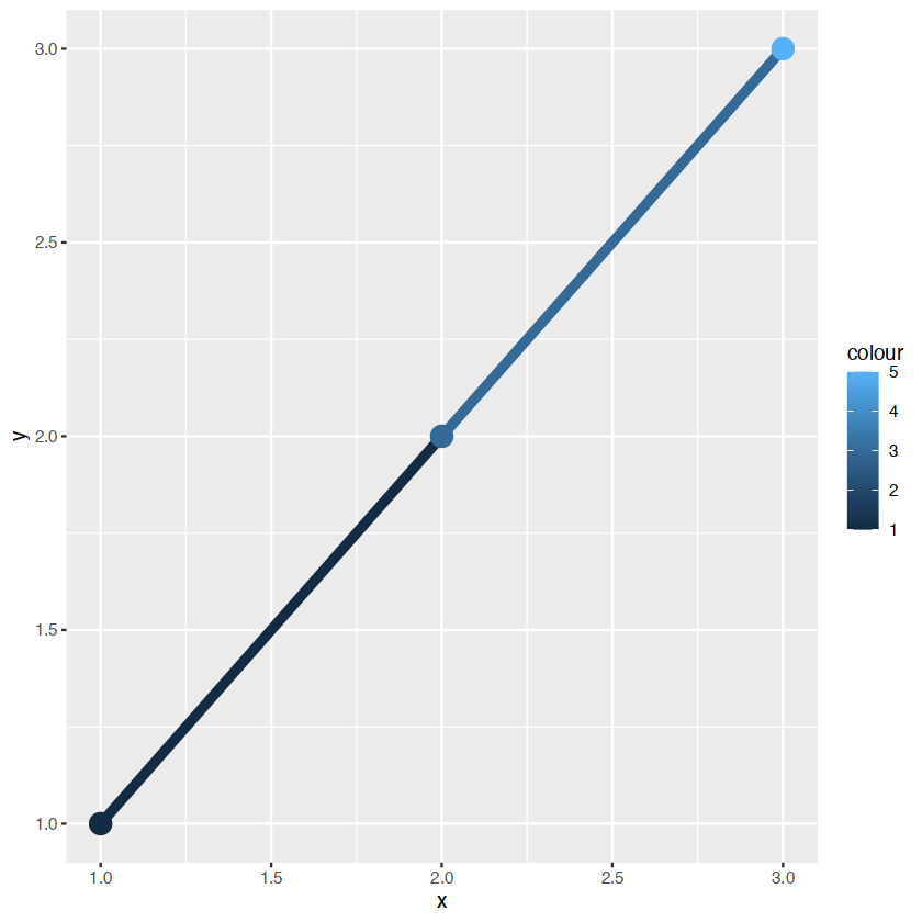
在左手边的颜色是离散的,右手边是连续的,即使颜色变量是连续的,ggplot不会平滑
library(ggplot2)
ggplot(data = diamonds) +
    geom_bar(mapping = aes(x = cut, y = ..prop.., group = 1))
Warning message:
“The dot-dot notation (`..prop..`) was deprecated in ggplot2 3.4.0.
ℹ Please use `after_stat(prop)` instead.”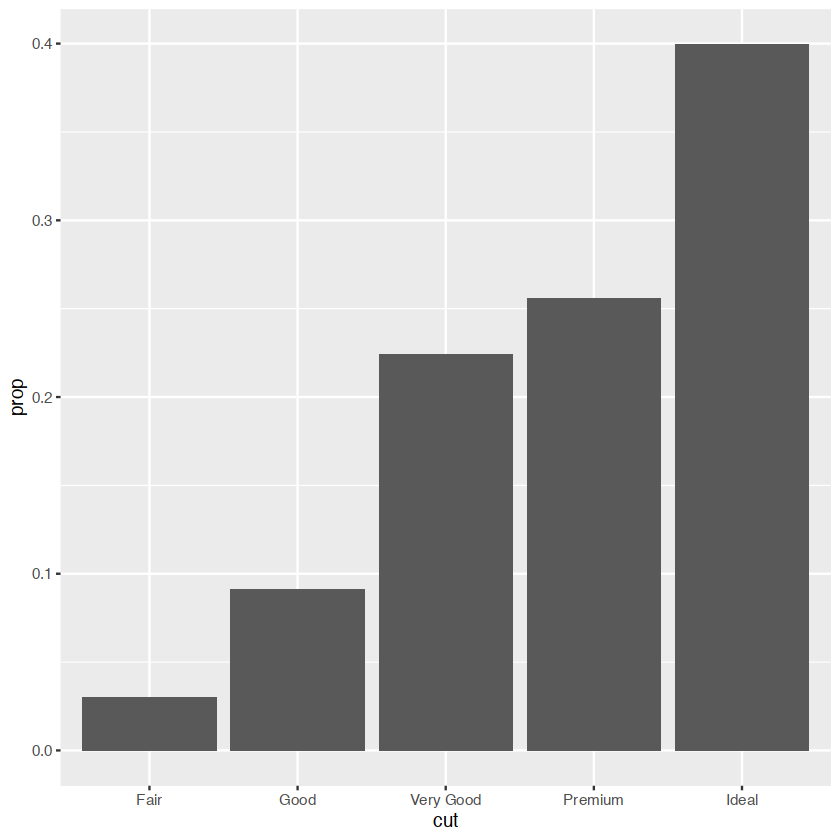
group="whatever" 是一个”虚拟”分组来覆盖默认行为,(这里)是按 cut 分组,通常是按x 变量.geom_bar的默认值是按 x 变量分组,以便分别计算 x 变量的每个级别中的行数.例如,在这里,geom_bar默认返回cut 等于"Fair"、"Good"等的行数.
但是,如果我们想要比例,那么我们需要将所有级别的cut一起考虑.在第二个图中,数据首先按cut分组,因此分别考虑 cut的每个级别.Fair in Fair 的比例是 100%,Good in Good 等的比例也是如此.group=1(或 group="x" 等)阻止了这一点,因此每个级别的削减比例将相对于所有削减水平.
xgrid <- with(df, seq(min(x), max(x), length = 50))
interp <- data.frame(
  x = xgrid,
  y = approx(df$x, df$y, xout = xgrid)$y,
  colour = approx(df$x, df$colour, xout = xgrid)$y
)
ggplot(interp, aes(x, y, colour = colour)) +
  geom_line(size = 2) +
  geom_point(data = df, size = 5)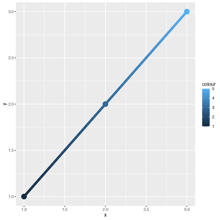
若我们要进行混合渐变形式,
ggplot(mpg, aes(class)) +
  geom_bar()
ggplot(mpg, aes(class, fill = drv)) +
  geom_bar()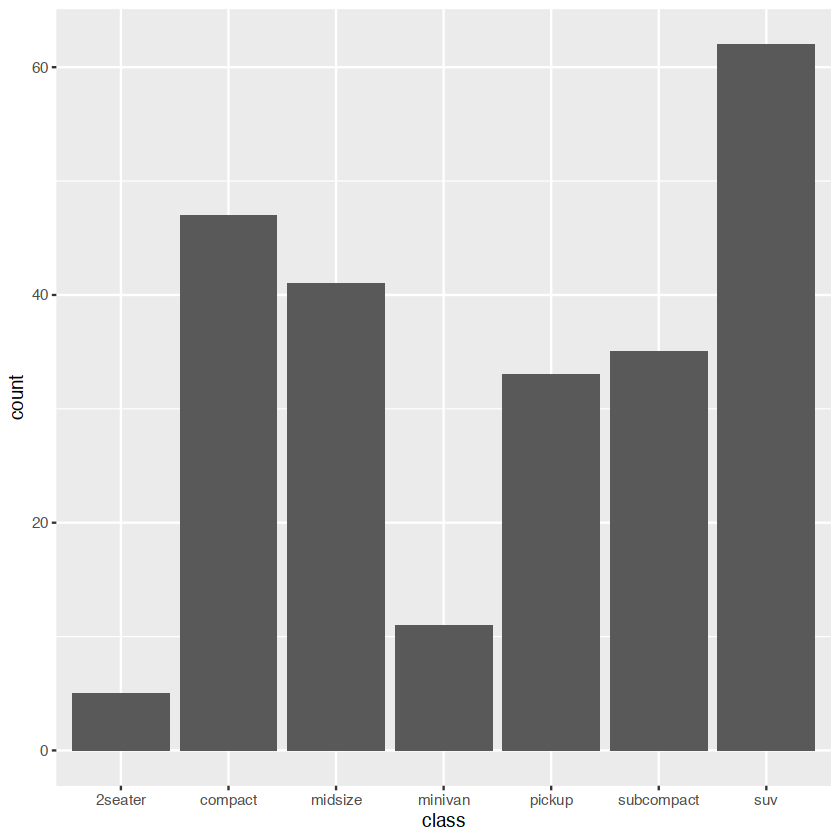
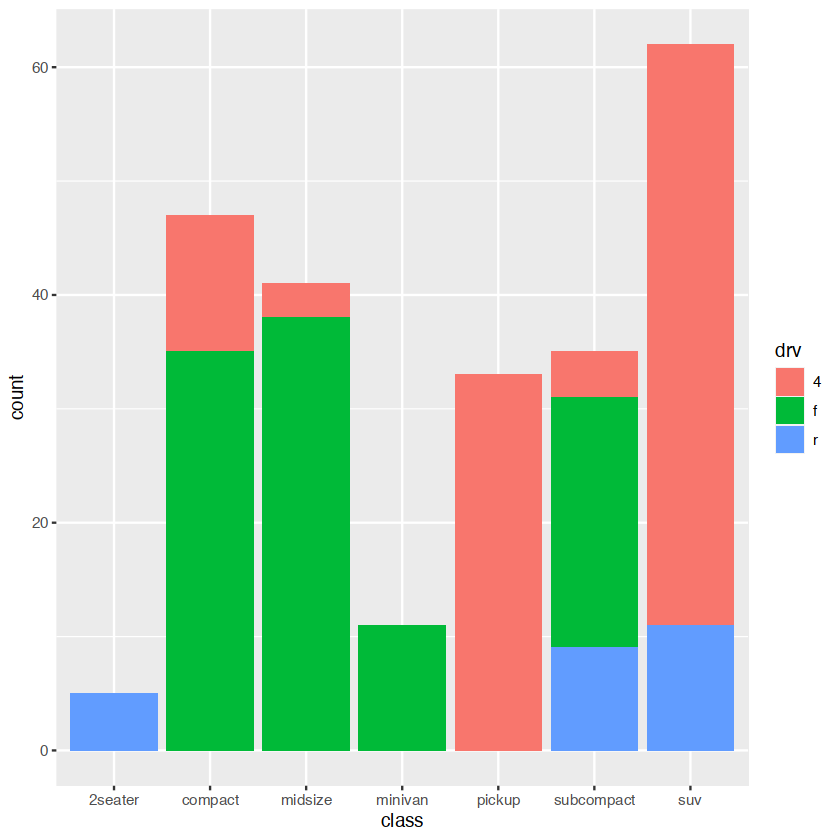
显示多种颜色,需要多种的bars对于每一个class
statistical summaries
A layer combines data, aesthetic mapping, a geom (geometric object), a stat (statistical transformation), and a position adjustment. Typically, you will create layers using a geom_ function, overriding the default position and stat if needed.
revealing uncertainty
having the infomation about the uncertainty present in your idea
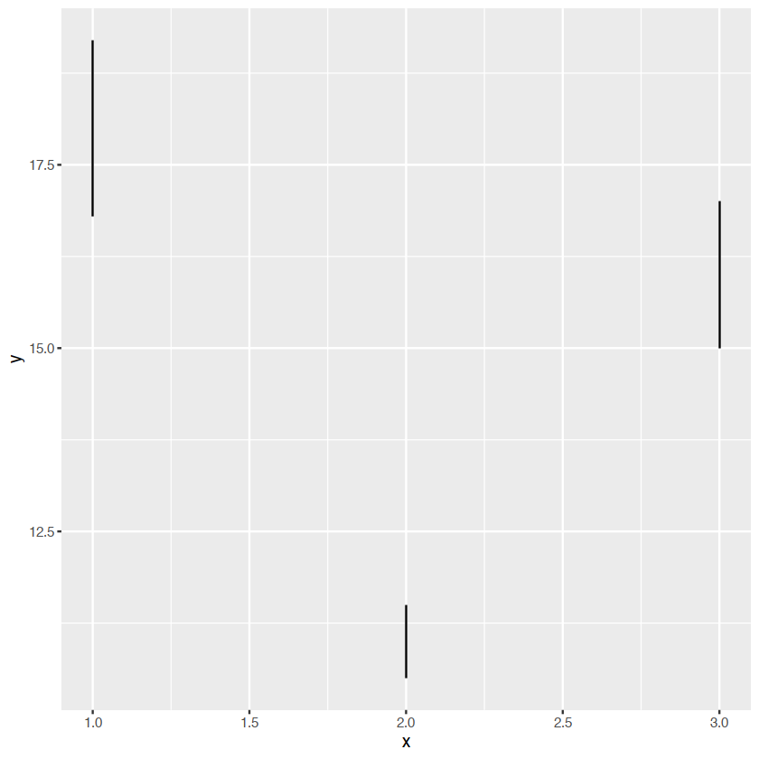
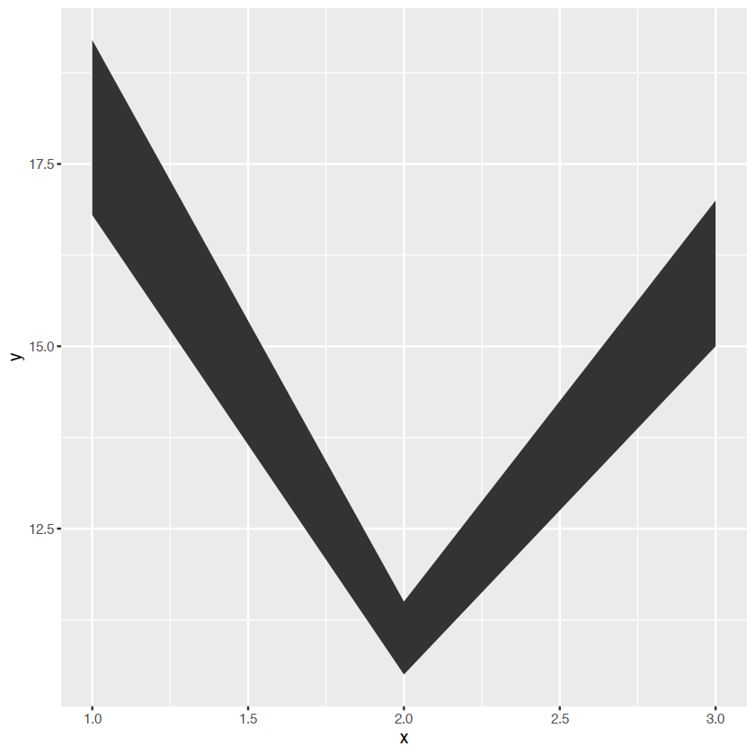
- discrete x,range:
geom_errorbar(),geom)linerange() - discrete x,range¢er:
geom_crossbar(),geom_pointrange() - continuous x,range:
geom_ribbon() - continuous x,range¢er:
geom_smooth(stat="identity")
y <- c(18,11,16)
df <- data.frame(x=1:3,y=y,se=c(1.2,0.5,1.0))

base <- ggplot(df,aes(x,y,ymin=y-se,ymax=y+se))
箱线图
base+geom_crossbar()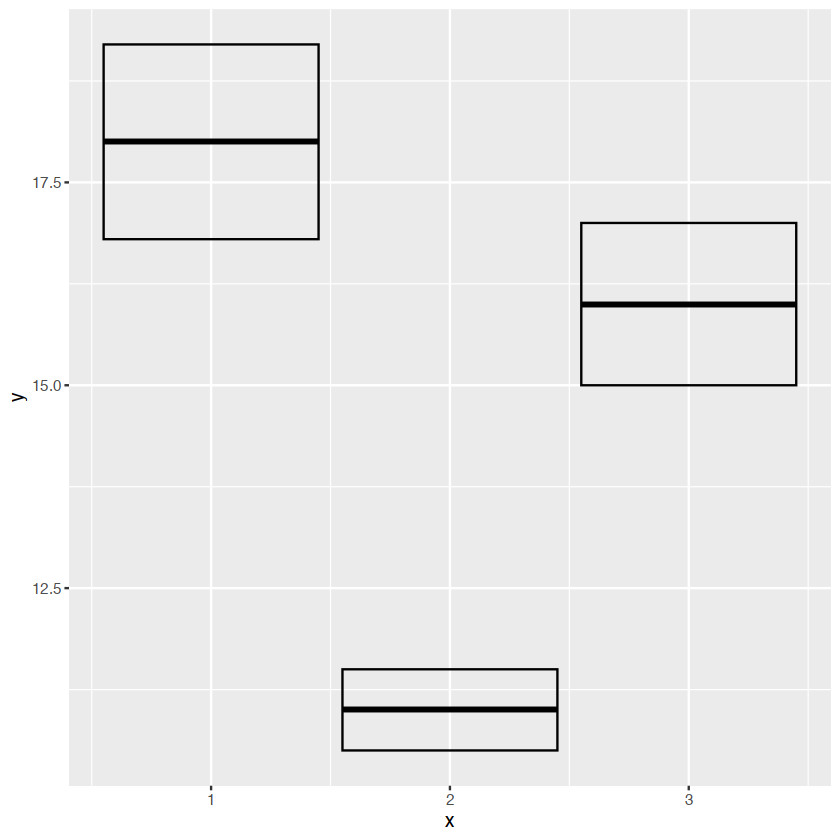
base+geom_pointrange()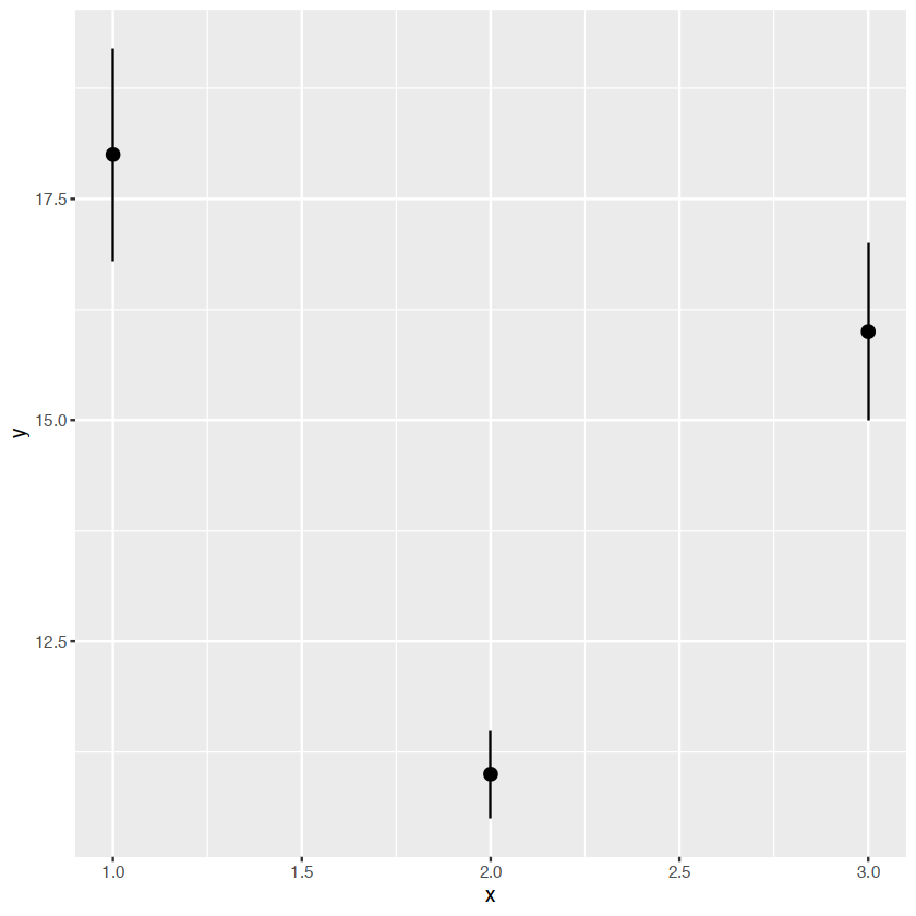
base+geom_smooth(stat="identity")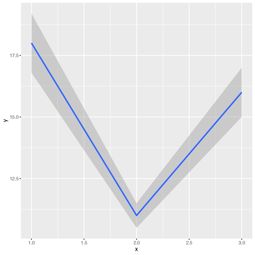
base+geom_errorbar()
base+geom_linerange()
base+geom_ribbon()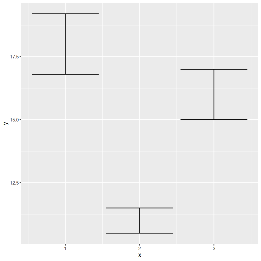
weighted data
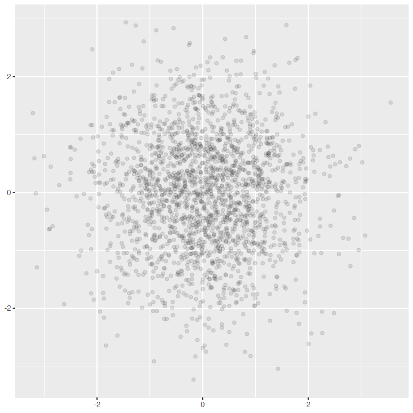
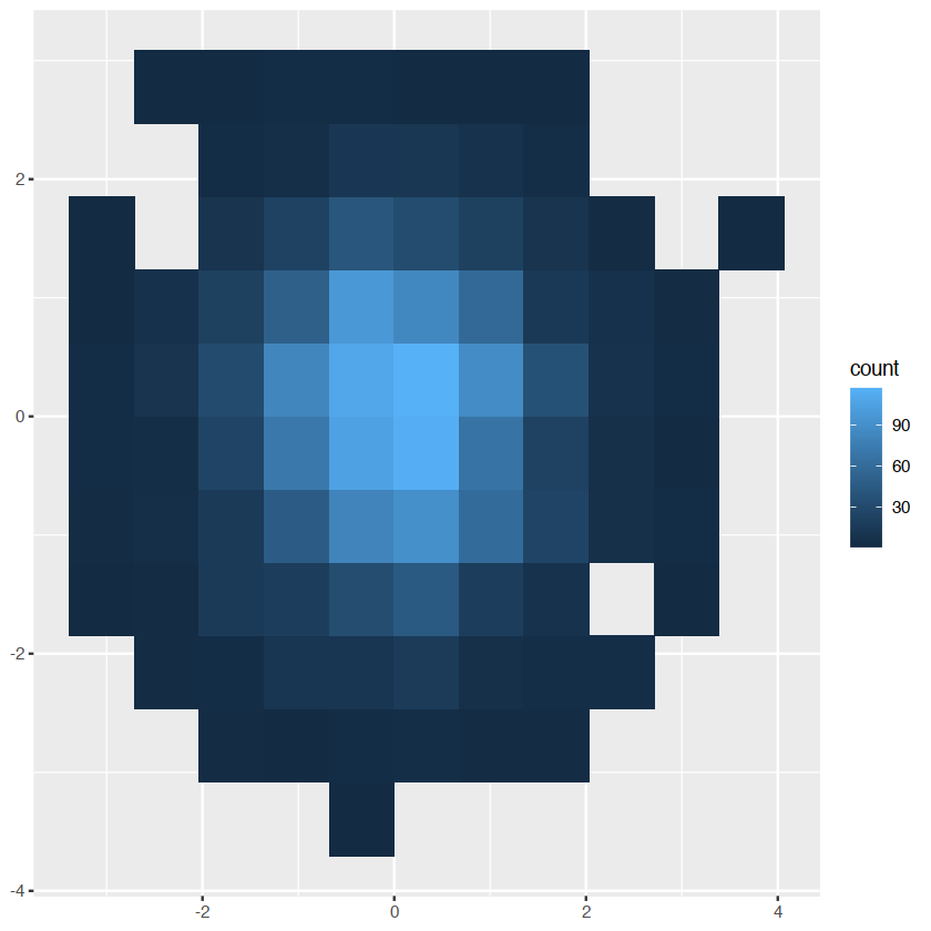
dealing with overplotting
constructing a bi-gauss distribution
df <- data.frame(x = rnorm(2000), y = rnorm(2000))
norm <- ggplot(df, aes(x, y)) + xlab(NULL) + ylab(NULL)
norm + geom_point()
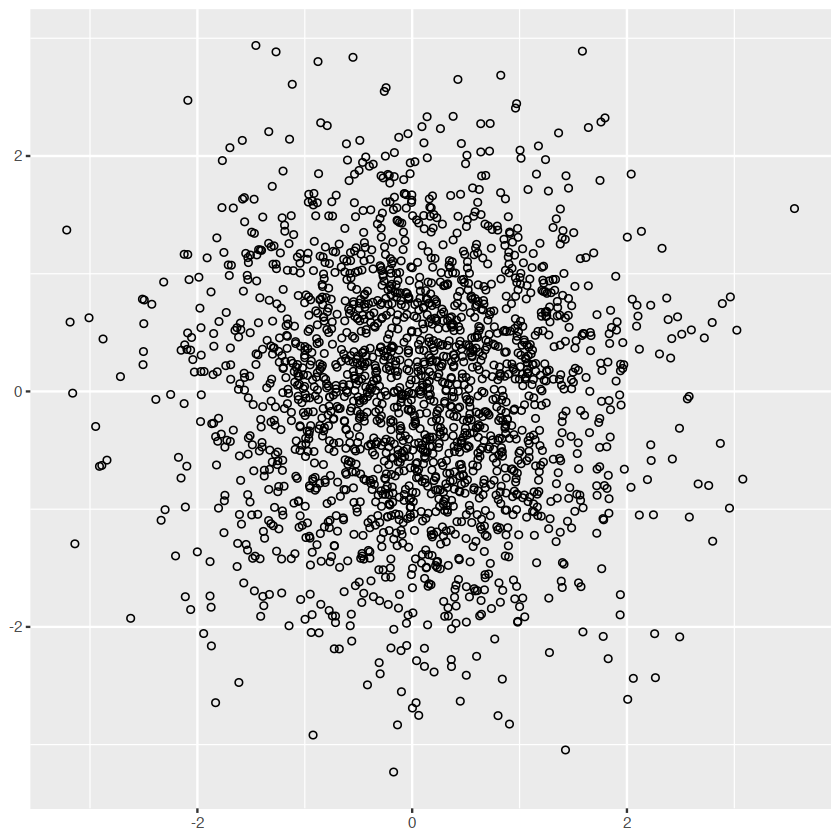
norm + geom_point(shape = 1) # Hollow circles "1"is circle,"2"is rectangle
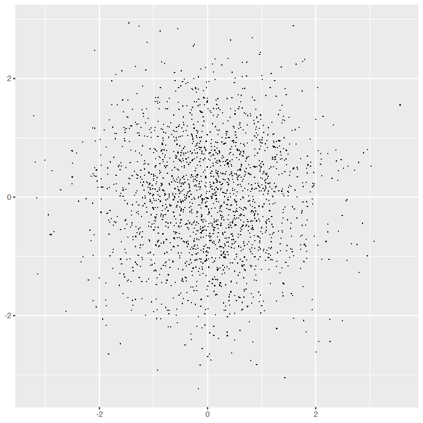
norm + geom_point(shape = ".") # Pixel sized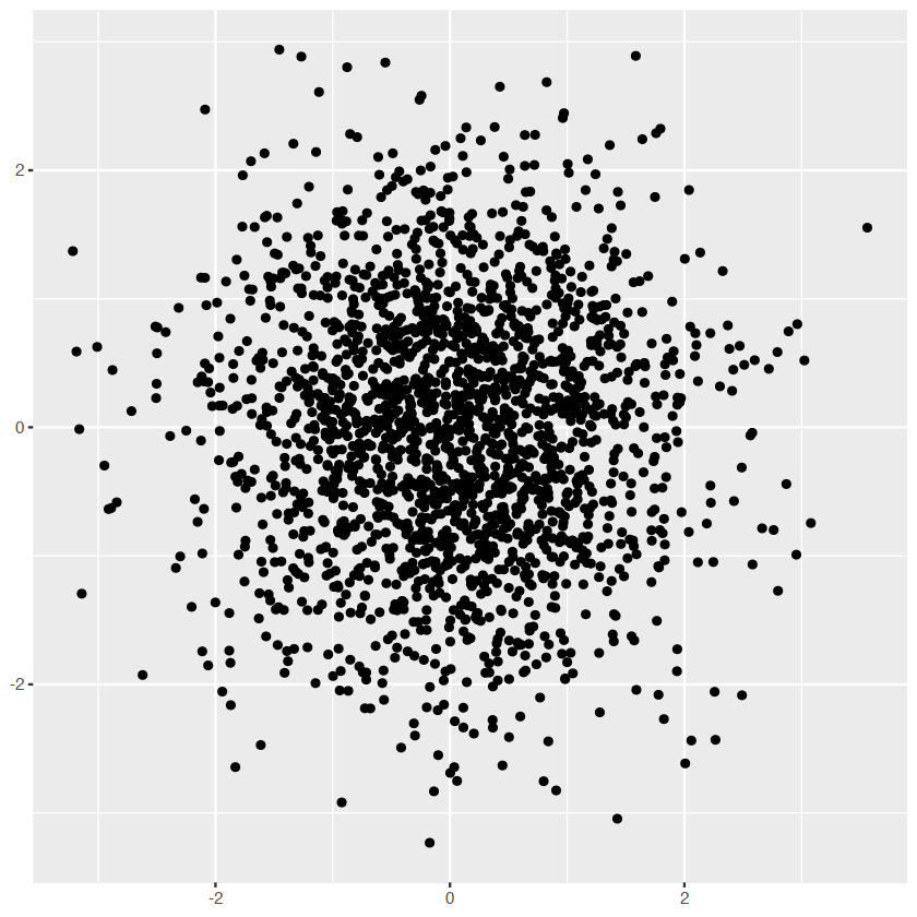
adjust the opacity
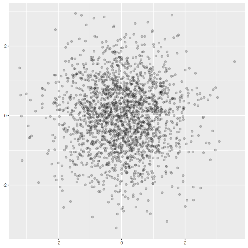
norm + geom_point(alpha = 1 / 3)
norm + geom_point(alpha = 1 / 5)
norm + geom_point(alpha = 1 / 10)
normnorm +geom_bin2d()
norm + geom_bin2d(bins=10)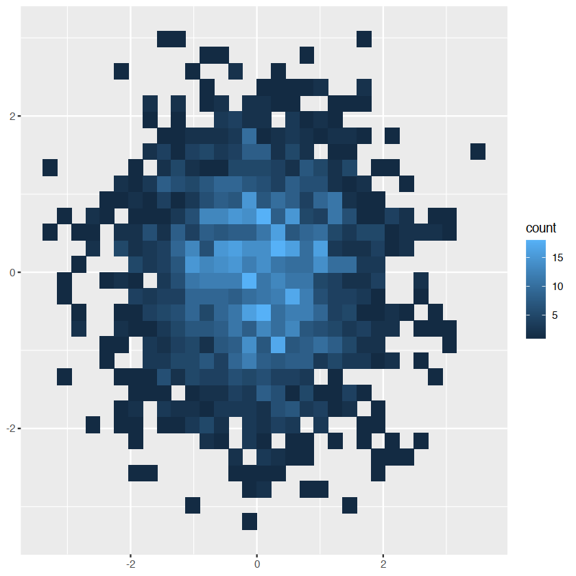
- Estimate the 2d density with
stat_density2d()
Statistical summaries
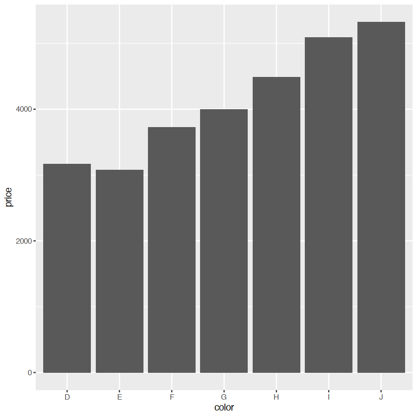
barggplot(diamonds, aes(color)) +
geom_bar()
ggplot(diamonds, aes(color, price)) +
geom_bar(stat = "summary_bin", fun = mean)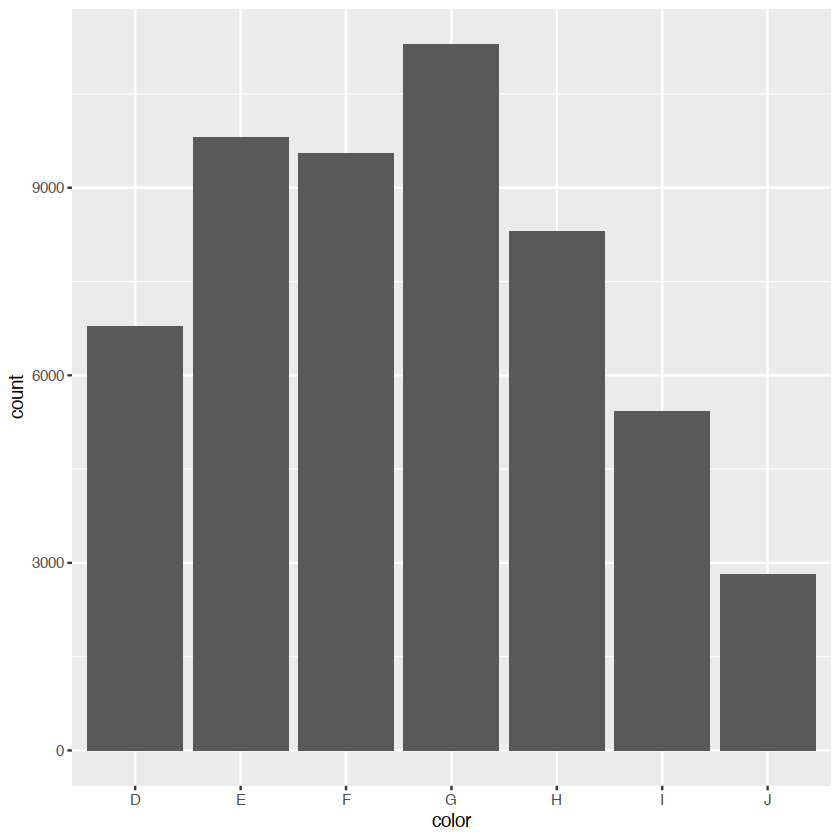
surfaces
we are considered two classes of geoms: - simple geoms where there’s a one-on-one correspondence between rows in the data - statistical geoms where introduce a layer of statistical summaries in between the raw data and the fault - we will consider cases where a visualization of a three dimensional surface
data(faithfuld)ggplot(faithfuld,aes(eruptions,waiting))+
geom_contour(aes(z=density,color=..level..))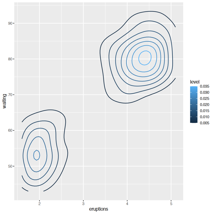
..level.. 变量
..意味着一个内部计算的变量
演示相同的分布做一个热力图
ggplot(faithfuld, aes(eruptions, waiting)) +
  geom_raster(aes(fill = density))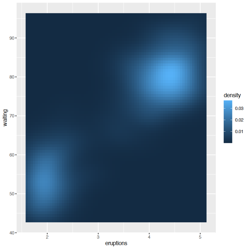
generated variables
a stat takes a data frame as input and returns a data frame as output, and so a stat can add new variables to the original dataset
Geoms
geometric objects or geoms for short,perform the actual rendering of the layer, controlling the type of plot that you create.
- graphical primitives:
geom_blank():啥也没有geom_point()pointsgeom_path()geom_rect()rectangles.geom_ploygon()filled polygons.geom_text()
- One variable:
- discrete
- continuous
- two variables:
- both continuous:
geom_point()geom_smooth()
- both continuous:
- three variables:
geom_contour()geom_tile()geom_raster(): fast version ofgeom_tile()for equal sized tiles
Stats
统计变换,或统计转换数据,通常是用某种方式来总结它
stat_bin()stat_bin2d()stat_bindot()stat_binplot()
other stats can’t be created with a geom_ function
ggplot(mpg,aes(trans,cty))+
    geom_point()+
    stat_summary(geom="point",fun="mean",color="red",size=4)
ggplot(mpg,aes(trans,cty))+
    geom_point()+
    geom_point(stat="summary",fun="mean",color="red",size=4)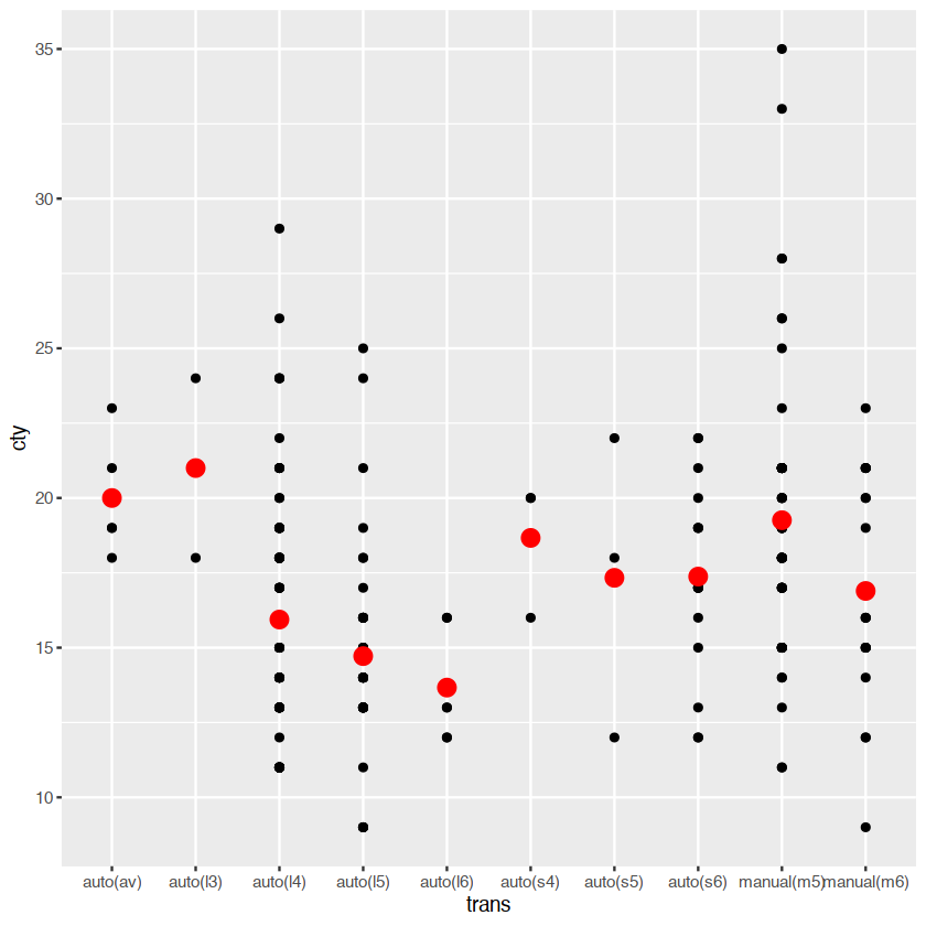
the way to use these functions. you can either add a stat_() function and override the default geom or add a geom_() function and override the default stat:
generated variables
a stat takes a data frame as input and returns a data frame as output, and so a stat can add new variables to the original dataset. it is possible to map aesthetics to these new variables. example: stat_bin 用于构建histogram 产生一系列的变量: - count,the number of observation in each bin - density the density of observation in each bin - x the centre of the bin
ggplot(diamonds,aes(price))+
    geom_histogram(binwidth = 500)
the after_stat() must wrap the name, preventing the confusion in case the original dataset includes a variables with the same name as a generated variable
ggplot(diamonds,aes(price))+
    geom_histogram(aes(y = after_stat(density)),binwidth=500)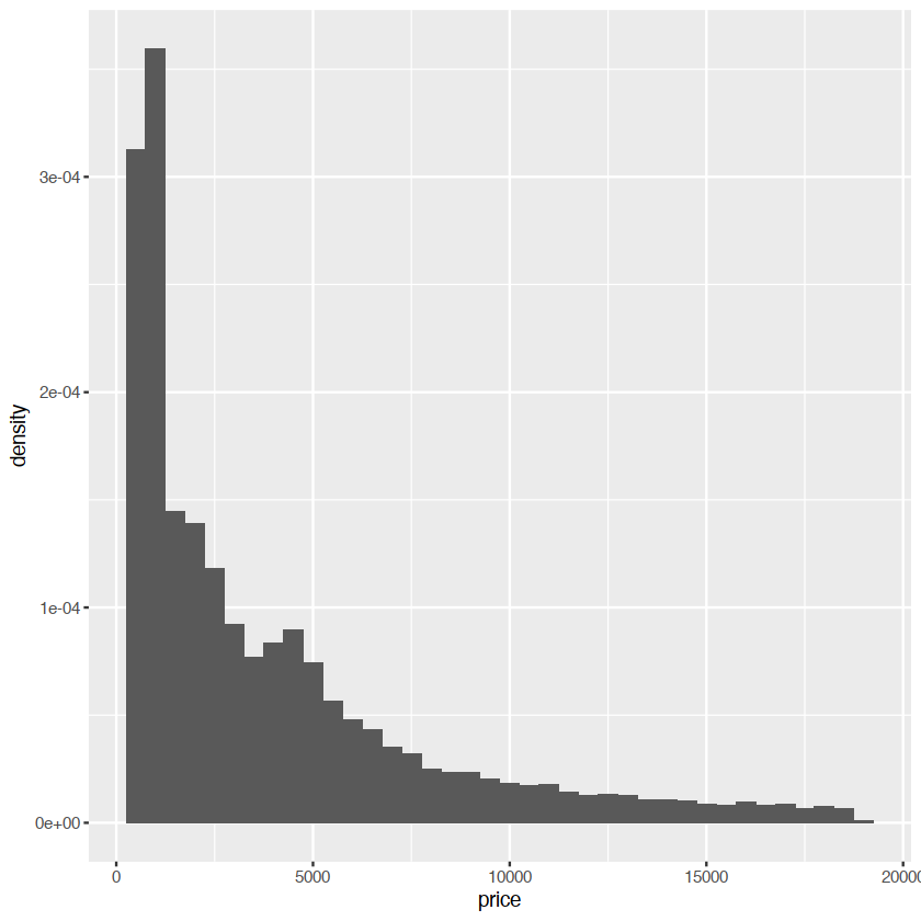
scale and guides
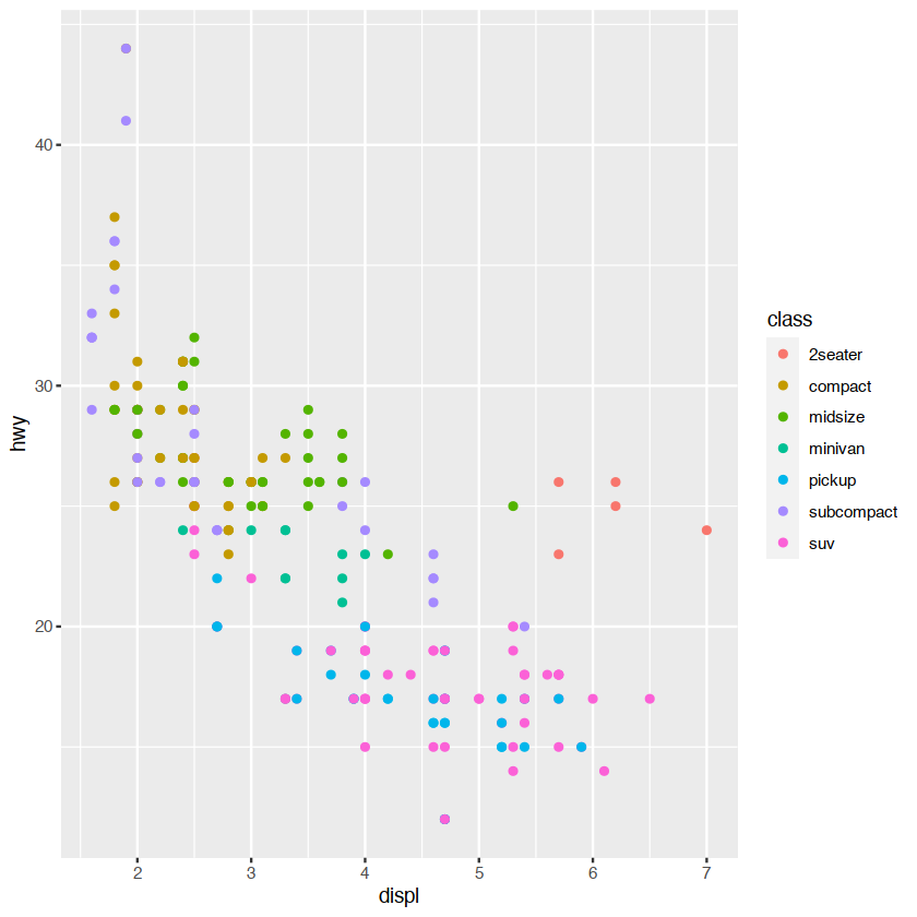
ggplot(mpg, aes(displ, hwy)) +
  geom_point(aes(colour = class))