from sklearn.metrics import roc_curve, aucimport numpy as np
from sklearn import metrics
y = np.array([1, 1, 2, 2])
scores = np.array([0.1, 0.4, 0.35, 0.8])fpr, tpr, thresholds = metrics.roc_curve(y, scores, pos_label=2)fprarray([0. , 0. , 0.5, 0.5, 1. ])thresholdsarray([1.8 , 0.8 , 0.4 , 0.35, 0.1 ])auc = metrics.auc(fpr, tpr)auc0.75import matplotlib.pyplot as plt
plt.figure()
lw = 2
plt.plot(fpr, tpr, color='darkorange',
lw=lw, label='ROC curve (area = %0.2f)' % auc)
plt.plot([0, 1], [0, 1], color='navy', lw=lw, linestyle='--')
plt.xlim([0.0, 1.0])
plt.ylim([0.0, 1.05])
plt.xlabel('False Positive Rate')
plt.ylabel('True Positive Rate')
plt.title('Receiver operating characteristic example')
plt.legend(loc="lower right")
plt.show()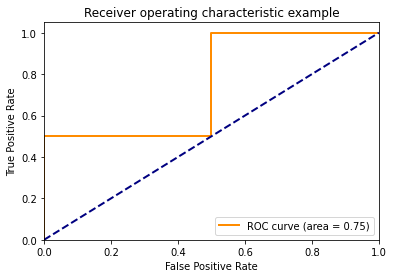
RUC(Receiver Operating Characteristic Curve)受试者工作特征曲线
该曲线的横坐标为假阳性率(False Positive Rate, FPR),N是真实负样本的个数, FP是N个负样本中被分类器预测为正样本的个数。 纵坐标为真阳率(True Positive Rate,TPR) \[TPR = \frac{TP}{R} \]
阈值:就是一个极限,或许是超过这个极限会发生某些情况,又或是在这个极限之下又会发生某些事件。